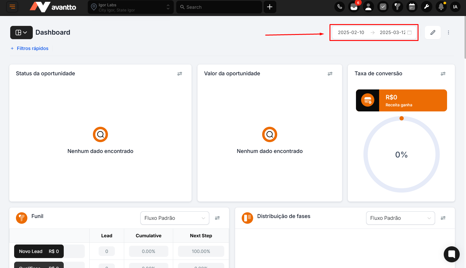
Location on the Dashboard : In the top right corner of the dashboard, there's an option to set the analysis period.
Functionality :
The user can select a specific date range to filter the data that will be displayed.
Example : Select "January 1" to "March 12" to view data for this range.
Importance : Defining the time period is essential to ensure the analyzed data matches the desired context.
After setting the time period, the next step is to choose the type of data that will be displayed. This configuration directly affects how the charts are interpreted.
Status Changed :
Description : Displays data about opportunities whose status was changed during the selected period.
Interpretation : The information reflects the changes in stage or status of the opportunities during the period.
Created in the Period :
Description : Shows data about opportunities that were created within the specified period.
Interpretation : Refers to new opportunities generated within the time frame.
Updated :
Description : Displays data about opportunities that were updated (e.g., stage, description, etc.) during the period.
Interpretation : Indicates which opportunities were modified, regardless of whether or not they advanced in the pipeline.

Functionality : When setting the period and type of data, all visualizations on the dashboard are updated automatically.
Practical Example :
If the period is set as "January 1st to March 12th" and the data type as "Created On," all charts will display only the opportunities created within that range.
Result : In the mentioned example, only one opportunity was created in the selected period.
The key visualization options on the panel include:
Project Level : Defines the overall scope of the data.
Data Type : Specifies whether the data relates to opportunities created, updated, or with changed status.
Pipeline : Allows switching between different pipelines for more specific analysis (Available in only a few charts).